Captivate AI
MY ROLE
Product design owner
TIMELINE
4 months
THE PROBLEM
"You may not be able to read the text on this slide, so let me talk through it”, is almost a platitude in presentation lore.
Tools like Powerpoint and Keynote offer little in terms of design intelligence, often resulting in poorly designed slides.
Final presentation
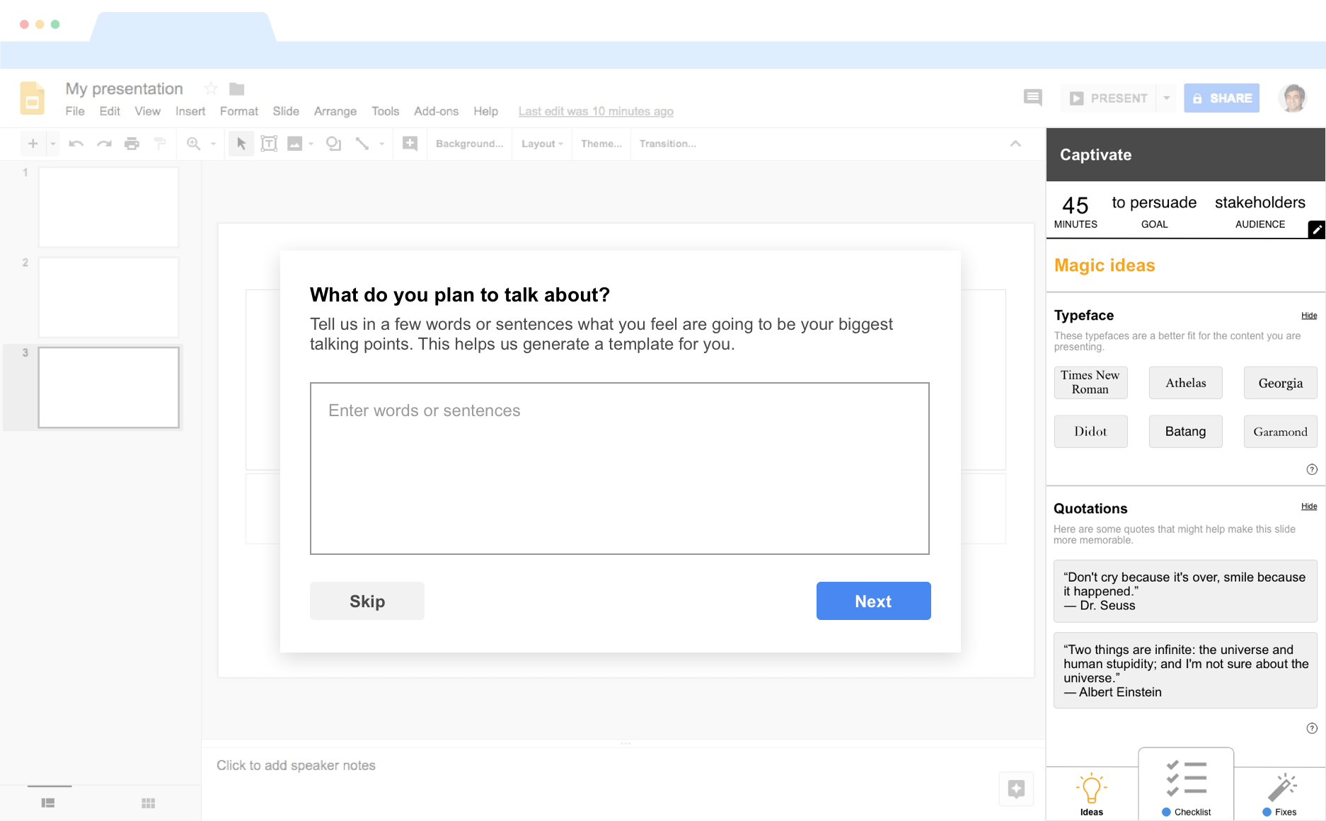
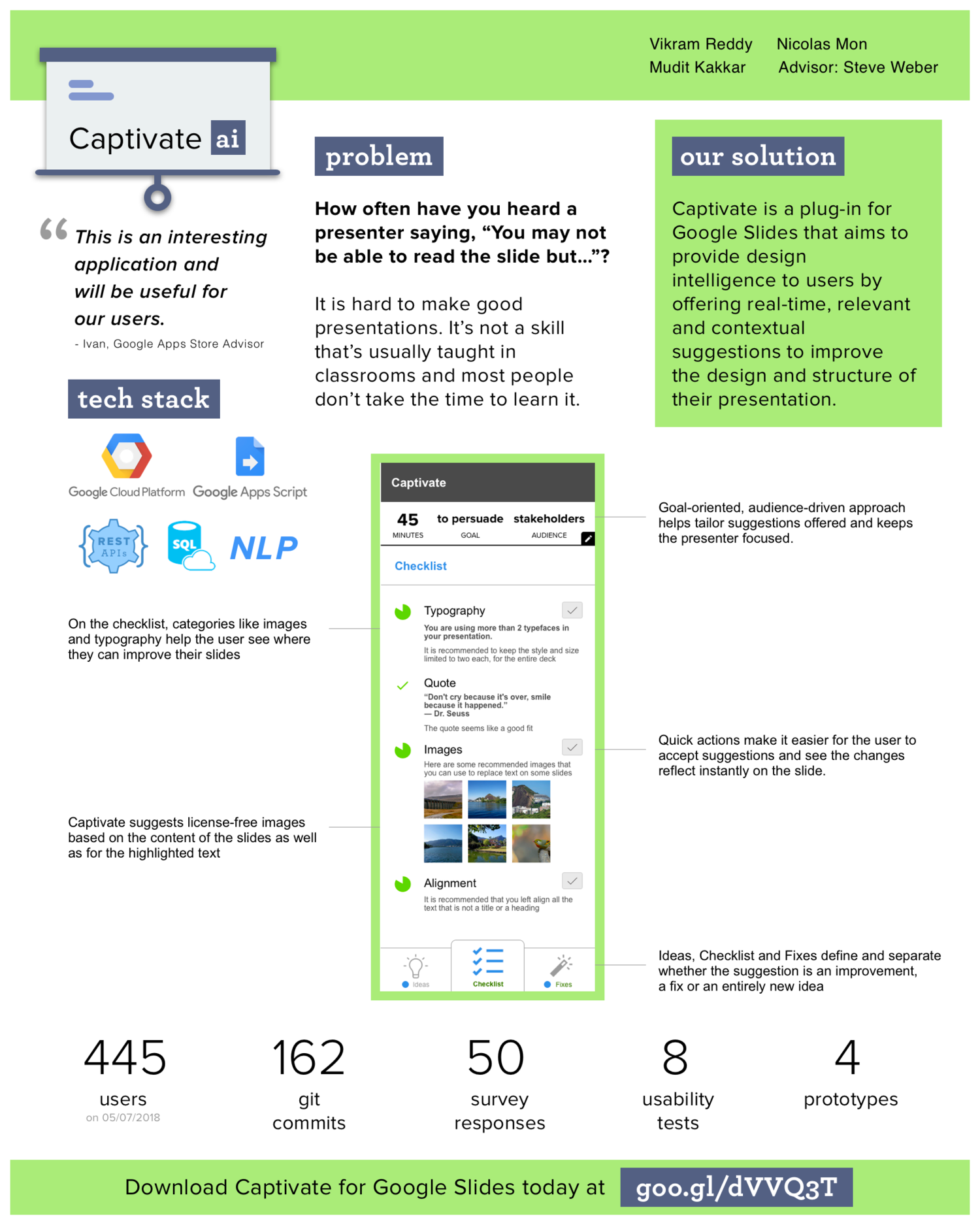
Captivate AI, a plugin for Google Slides that provides real-time recommendations for improving your slides, based on user-specified goals and machine learning.
MY APPROACH
I teamed up with 2 engineers who shared my passion for reimagining how presentations are made. We aligned on a goal and certain design principles to help us get there.
OUR GOAL
To help users create consistent, coherent and engaging presentations with minimal effort or expertise.
DESIGN PRINCIPLES
Simplicity
We wanted to set clear expectations with the interactions that we wanted to enable.
Scalability
We wanted to build for a platform with ample support for development, and with a steady user base.
Availability
Without being “Clippy”, we wanted to augment users' pre-learned behavior of creating presentations.
RESEARCH
We received 45 responses to our survey and interviewed 5 people. Here are some of the common themes that emerged.
More than 50% people use default typefaces in their decks.
“I don’t see the incentive in going through that long list of fonts. I am busy and work on more than one deck a day and the default one hasn’t failed me.”
40% people manually align elements in their slides.
"Making sure side-by-side pictures are aligned (tops and bottoms at the same level), as well as text boxes being aligned, equally distributed horizontally, etc.”
90% people feel that good aesthetic helps but only half of them work on it.
“I verify it myself. Probably should use a better way for it.”
“It looks pleasing to my eyes :)”
Almost everyone’s barometer for success is the audience’s feedback.
“I play the slideshow on behalf of the audience. If I put myself in the shoes of an audience member and can understand the content, I count that as a win”
DESIGN
Based on our research findings and our design goals, I began wireframing.
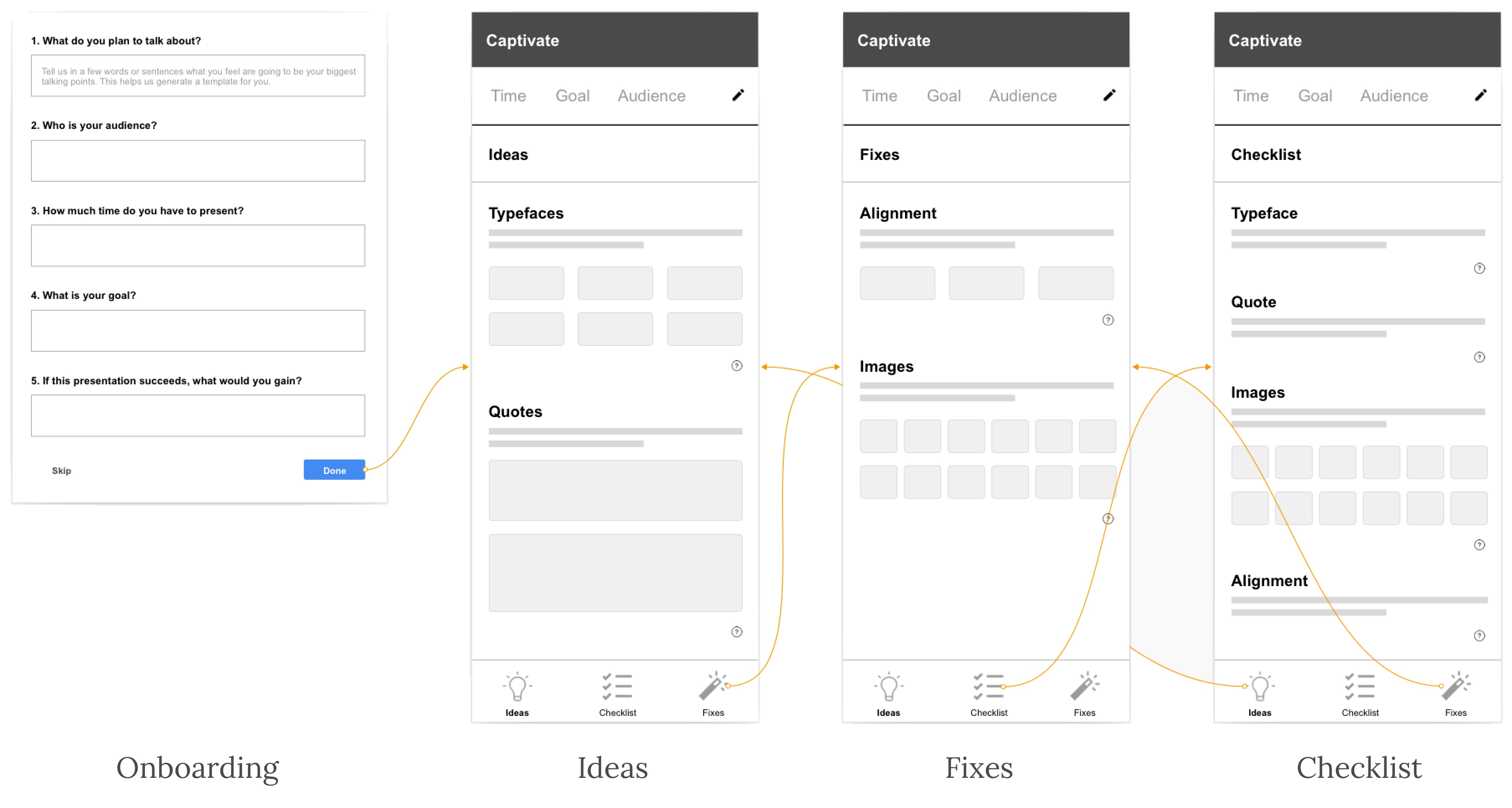
An initial brainstorm to help people organize their thoughts before working on the slides.
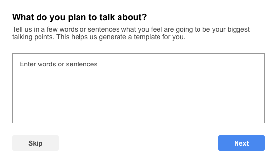
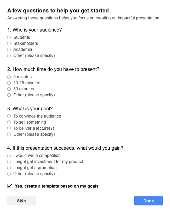
A questionnaire to help people define their goals before they begin working on the slides.
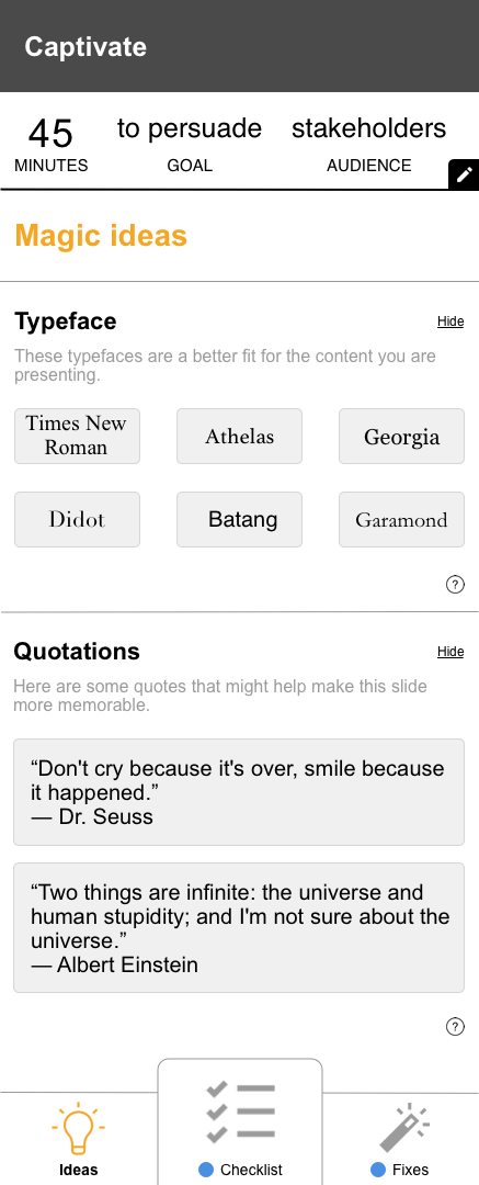
A magic ideas tab to introduce users to unique recommendations like type suggestions or quotations.
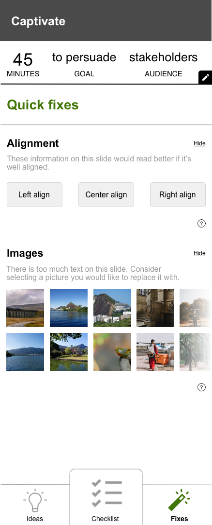
A quick fixes tab to help users tackle tasks that might otherwise involve several steps.
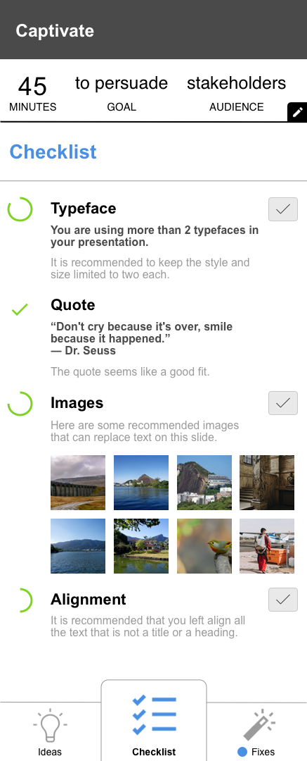
A checklist tab to help users view the aggregate of ideas and fixes in a single view and apply fixes.
USABILITY TESTING (8 participants)
They liked
- The goal oriented approach to presentations.
- The tabbed interface was learnable and discoverable.
They disliked
- The align feature was hard to grasp and use.
- That some of the icons did not have labels.
They wanted
- More than 3 people suggested they would love to see the plug-in offer pre-built themes for easy creation.
FINAL OUTCOME
We launched this plugin on the Google Add-Ons store. We had 445 users by the time we presented. Most recently, we had about 6000 users before the plugin was pulled due to inactivity. The final paper can be found here: https://tinyurl.com/y5qwow86.

MY LEARNINGS
Working with engineers
This was my first design project at graduate school that actually got built in code. Through this process, I built critical skills like being an advocate for the user, evangelizing the importance of usability and learnability, and grounding everyone in user feedback.
Features vs. benefits
There were certain features that we felt strongly about but we didn't want to add cognitive load. This is where user research and thinking in terms of tangible user benefits helped us scale back and spend our time only on what was truly important.
Transparency of algorithms
With increased public scrutiny of products that offer personalized recommendations, we only asked for the minimum required information in our plugin and kept the text in our privacy policy documentation straightforward.
I tried to write a joke in the footer, but I got cold feet. Also, here's my LinkedIn.